
Don Norman, the author of The Design of Everyday Things and one of the founders of the Nielsen Norman Group (a firm focused on user experience research) had a point to make about design:
“Good design is actually a lot harder to notice than poor design, in part because good design fits our needs so well that the design is invisible, serving us without drawing attention to itself. Bad design, on the other hand, screams out its inadequacies, making itself very noticeable.”
When we asked ChatGPT for an example of this phenomenon we could highlight in this article, it told us to consider… sewer systems?
It makes sense. When it’s designed to work well, we literally don’t even see it.
But when it isn’t working well and our streets are flooding with brown sewer water, we definitely see it (and smell it I suppose).
The same goes for website user experience design.
But with a little expertise, great design can be understood, and we think nonprofits can learn a lot from some of the well-designed donation experiences we’ve highlighted below.
After checking these out, it might be worth taking a look at your donation experience to see if your design sticks out!
charity: water
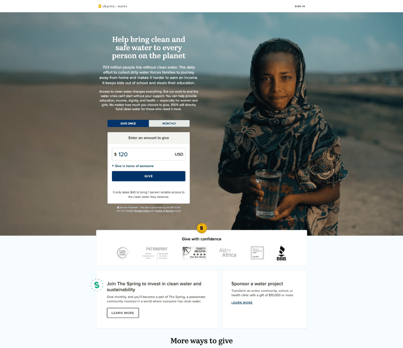
If you’re running a nonprofit and you haven’t looked at the charity: water website, do yourself a favor and check it out now. We believe it’s a masterclass in great design, compelling content, and smart technology choices for maximizing impact.
We’ve referenced their site a lot over the past few months, but for this article, we are zooming in just on their donation experience. While there are a lot of things to like about the way charity: water presents its giving experience, here are the highlights:
- Limited Distractions: By removing the main menu and other links from the page, visitors can focus on donating and aren’t tempted to navigate to other areas of the site.
- Low Friction: They’ve limited their form fields so that visitors don’t lose motivation to donate.
- Imagery: They present strong imagery to accompany “The Ask.”
- Content: They’ve got 3-4 sentences presenting their case and providing compelling context.
Special Olympics
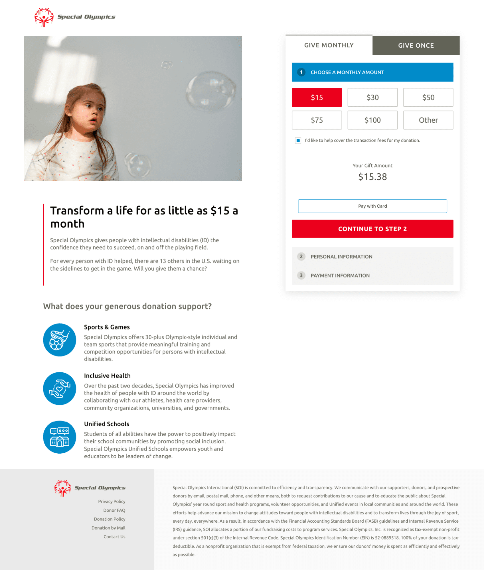
The donation experience for Special Olympics leverages some subtle but powerful strategies to encourage giving.
- Imagery: They include imagery of a human face looking at the donation form. Studies show that we follow other people’s eyelines, and this is a great example of following her eyes straight to the donation form.
- Defaults: Their donation total defaults to covering the cost of processing the donation. Many nonprofits include this as an option but Special Olympics took the next step and made this the default. A “nudge” so to speak.
- Low Friction: Rather than presenting a long list of fields, Special Olympics presents a “step-by-step” experience that makes the process of giving feel like less work. Notice instead of presenting 10 fields at once, they simply ask for the donation amount and then “Continue to Step 2.”
- Impact Statement: They’ve provided a clear measure of impact. According to them, $15 a month can transform a life, and who isn’t willing to do that?
The Innocence Project
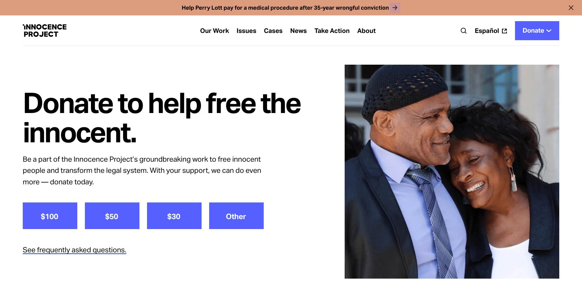
Beyond having an incredibly powerful and inspiring mission, to free those wrongfully convicted, The Innocence Project also presents a strong example in well-designed donation experiences. Here’s what we really like about this one:
- Imagery: The emotions and the smile on their faces is hard to ignore
- Content: In big type and bolded for emphasis, “Donate to help free the innocent” is a clear and powerful message.
- Low Friction: They provide 4 easy options to select for starting the donation process and you aren’t presented with a dozen fields to fill out.
Step Up For Students
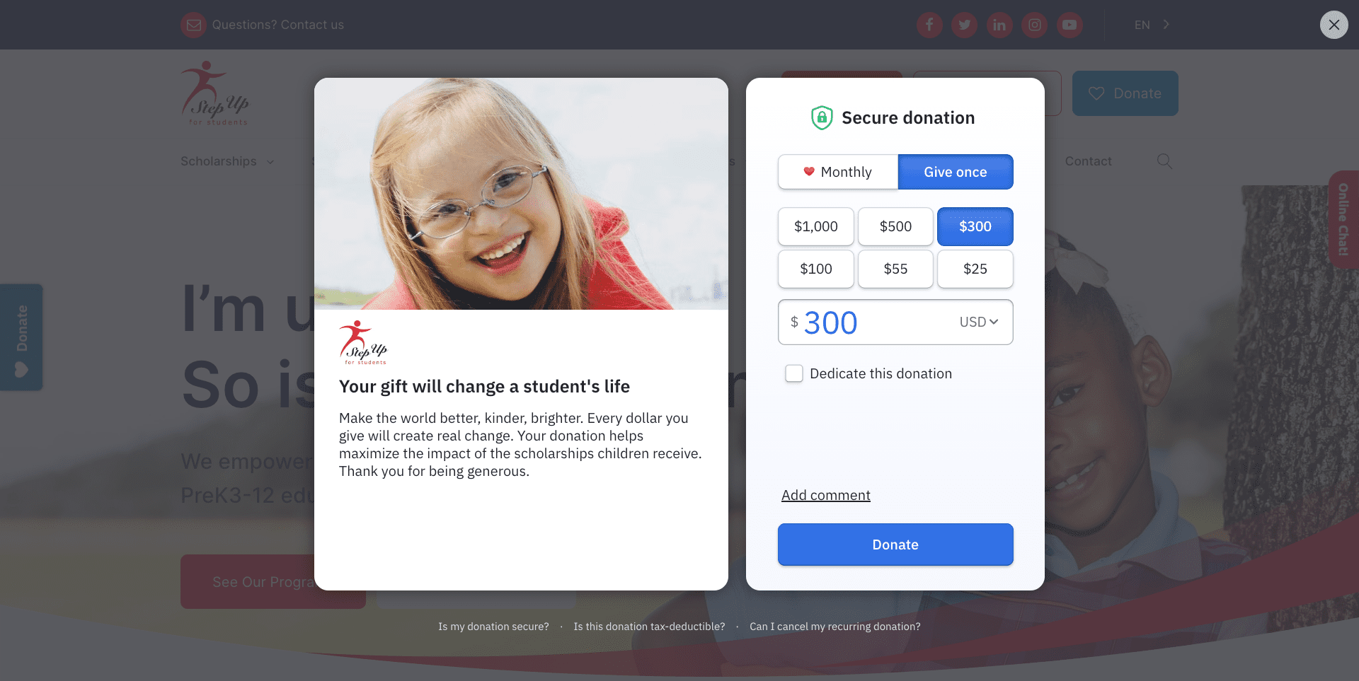
Step Up For Students is a nonprofit that provides scholarships to students in Florida so that parents can make more personal decisions about where they want to send their kids to school.
Here is what we like about their donation experience:
- Pop-Up Window: Studies show that every time you redirect visitors to a different page to donate, you lose a percentage of them. By having their donation experience open up in a popup instead of a new page, they are able to capture a larger percentage of potential donors.
- Low Friction: By prepopulating the donation amount field and limiting the data they collect on interested donors, they reduce the amount of effort needed to complete the transaction.
- Imagery: Included in the pop-up window is the smiling face of a young girl looking directly at the visitor. It might be stronger if she was looking at the donation form, but it is still effective at inspiring action.
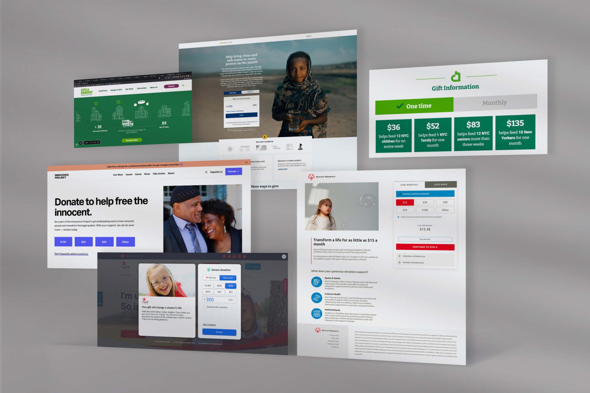
City Harvest
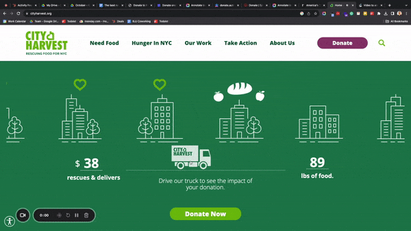
City Harvest is on a mission to rescue food and deliver it to those that need it most. While we didn’t necessarily cover their actual donation page here, we LOVE the way they showcase impact with their truck driving experience.
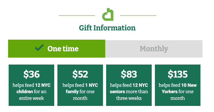
On their actual donation page, we do really like how they productized their donation levels by showcasing the specific and quantifiable impact available at each dollar amount, as shown below!
Final Thoughts
While we provided a list of the top donation experiences we’ve come across lately, what this list doesn’t show are the dozens of nonprofit donation experiences we’ve landed on that need work. We believe millions of dollars are being missed by nonprofits across America because they are not leveraging some of the core principles showcased by the nonprofits showcased above.
If you think your organization is one of those groups missing out on online donations, reach out! We can help.