
Most nonprofit organizations don’t realize that color can play a powerful role in conveying their mission, values, and messaging. From vibrant blues that evoke trust and stability to passionate reds that ignite urgency, organizations can strategically use colors to captivate hearts and minds.
In this article, we will dive into the basics of color theory, understand the psychology of color, and explore how nonprofit organizations can effectively use colors to enhance their brand, communications, and campaigns.
What is color theory and why is it important for nonprofits?
Color theory is the study of how colors interact with each other to create visually effective designs that influence behavior. In general, color theory is often used by nonprofit organizations to:
- Establish brand identity
- Evoke an emotional response
- Create visual hierarchies (for websites or other marketing content)
- Showcase partnerships or collaborations
- Foster accessibility
- Prompt action
Understanding color theory can assist nonprofit organizations in creating compelling visuals that resonate with their target audience and make a meaningful impact.
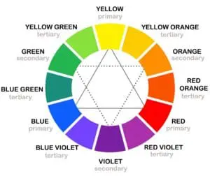
The color wheel
The color wheel is a visual representation of the relationships between different colors. It consists of:
- Primary colors (red, blue, and yellow)
- Secondary colors (green, orange, and violet)
- Tertiary colors (created by mixing primary and secondary colors)
Understanding the color wheel is crucial in creating harmonious color combinations that convey the desired message and evoke the desired emotions.
Psychology of color
Colors have a psychological impact on our emotions, thoughts, and behavior and color psychology can provide valuable insights into how certain colors make your viewers feel. For example:
- Red: Often associated with passion, energy, and urgency. It can be used to evoke strong emotions and create a sense of urgency in fundraising campaigns.
- Blue: Often associated with trust, stability, and reliability. It can be used to create a sense of professionalism and trust in communications related to organizational integrity.
- Green: Often associated with nature, growth, and sustainability. It can be used to convey an environmentally friendly message or represent social responsibility.
- Yellow: Often associated with warmth, optimism, and happiness. It can be used to create a positive and uplifting mood in communications related to social impact.
- Orange: Often associated with creativity, enthusiasm, and excitement. It can be used to create a sense of energy and vitality in campaigns related to creative or innovative initiatives.
- Purple: Often associated with luxury, spirituality, creativity and power. It can be used to convey a sense of elegance, prestige or courage in communications related to high-end initiatives.
How to use color theory in your nonprofit
For new nonprofits looking to establish their brand colors, or veteran organizations looking to refresh their marketing materials, it’s crucial to consider a few key things:
Set goals
Before choosing the right colors for your nonprofit — whether you’re looking to pick brand colors, or simply design a specific campaign landing page — it’s important to determine your specific goals. Specific color goals might include:
- Creating urgency
- Standing out from competitors
- Evoking emotion
- All of the above!
Determine values
Once you’ve determined your specific goals for your color selection, consider your values as an organization. Ask yourself, and your marketing team, the following questions:
- What do we want these colors to say about us?
- Are there any cultural considerations at play?
- What colors feel representative of our mission and goals?
Conduct research
Conduct research on color psychology, cultural symbolism, and existing nonprofit brands.
Gather inspiration from other nonprofits or organizations with similar goals to spark ideas for your brand color palette.
Consider audience
Consider how your target audience may perceive different colors. Take into account cultural backgrounds, demographics, and the emotions you want to evoke. Ensure your brand colors resonate with your intended audience.
Test and refine
Create mockups and test how your brand colors appear in different contexts, such as on digital platforms, print materials, or merchandise. Evaluate their readability, legibility, and overall visual appeal. Seek feedback from stakeholders and your target audience, and make adjustments if necessary.
Evolve and adapt
As your nonprofit evolves and grows, periodically review and assess your brand colors to ensure they continue to align with your mission, values, and audience perceptions. Make adjustments if needed, while maintaining a consistent visual identity.
Color theory in action
Now that we understand the basics of color theory and the psychology of color, let’s explore some examples of how nonprofit organizations effectively use colors in their branding, communications, and campaigns.
Establishing a strong brand identity
Colors play a pivotal role in establishing a brand identity. This includes using colors in:
- Logos
- Websites
- Event pamphlets
- Social media graphics
- And other marketing materials
When crafting a brand, consider the values, mission, and target audience of your organization. Studies have shown that whether your viewer likes the color you’ve chosen matters far less than whether they perceive the color as appropriate for your organization and what you do. Instead of attempting to guess your donor’s preferred color, select colors that align with your brand personality and convey the desired emotions.
When it comes to what colors to choose for your branding, remember that you are telling a story of who you are without using words.
Example #1: #EqualEverywhere
Shades of purple are often found in nonprofits relating to women or girls. Purple can instill a sense of loyalty or dignity to a cause, and its regal hue often evokes a sense of empowerment and confidence.
The color purple has long been associated with the feminist movement and the pursuit of gender equality. As such, #EqualEverywhere chose to primarily use the color purple to represent their organization’s fight for gender equality. Their branding leverages the color’s ability to inspire and create a sense of unity among their supporters.

Example #2: Feed the Children
If the focus is on children, bright primary colors may seem more fitting than dull neutrals. Bright colors have a profound effect on human emotions, often evoking positive and joyful responses.
Instead of focusing on the meaning of one or two colors, Feed the Children chose a palette of four bright primary and secondary colors. These colors are often found together in children’s toys and classrooms and represent children’s boundless creativity and imagination.

By utilizing a vibrant color palette, they’ve created an emotional connection with their target audience, generating a sense of happiness, enthusiasm, and excitement. These positive associations help in fostering trust and establishing a memorable brand identity.
Cultivating an emotional response
Colors have the power to communicate messages on a subconscious level, eliciting specific emotions and responses. Nonprofit organizations can strategically use colors in their campaigns to reinforce their message and evoke the desired reactions from their audience.
When choosing colors to elicit an emotional response, remember to consider the target audience and the intended message of the campaign to ensure that the chosen colors communicate effectively.
Example #1: American Red Cross
Fundraising campaigns can benefit from warm colors like red or yellow, creating a sense of urgency and encouraging immediate action.
In their Missing Type Campaign, American Red Cross solely uses their branded red color to put emphasis on the urgency of the cause. They even went as far as making the campaign photo black and white to draw the eye to the most important information on the poster.

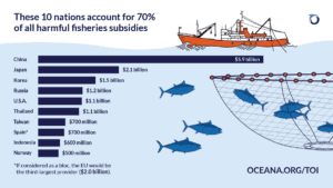
Example #2: Oceana
Marine life advocacy initiatives are often represented by shades of blue. Not only does a viewer find it an appropriate color to associate with an organization focused on ocean life, but it also conveys a calming and trustworthy message.
Established in 2001, Oceana is the largest organization in the world that is solely devoted to marine conservation. Oceana chose shades of blue for their branding and communications, consistently using blue throughout their campaign materials for brand recognition and to instill trust in their stakeholders.

Ensuring accessibility and inclusivity
Nonprofit organizations should also consider the accessibility of colors choices to ensure that they are inclusive and considerate of individuals with visual impairments or color blindness. This can be achieved by using high contrast color combinations and following accessibility guidelines such as the Web Content Accessibility Guidelines (WCAG). You can use free tools such as:
- WebAim: to test the contrast between colors
- Accessible Color Palette Builder: to see how you can mix and match the colors in your current color palette to make it more accessible
Final thoughts
By carefully crafting their branding and communications with color psychology in mind, nonprofits can create powerful visuals that resonate with their audience. Whether it’s raising awareness for a vital cause, promoting inclusivity, or inspiring action, color choices can be carefully selected to evoke specific emotions and foster deeper connections.