When someone visits your nonprofit website, are they shopping? At first, the idea of associating something like shopping with impact-giving and philanthropy feels unethical. But, a closer look reveals important overlaps between online consumer behavior and giving that all nonprofits should leverage.
Whether we like to admit it or not, the same people who are donating to your nonprofit online are the same people that are purchasing consumer goods online. Meaning, donors are consumers. Therefore, they expect similar online experiences—regardless of whether they are buying a new mattress or donating to your organization.
In this article, we’ll walk through the 4 things that nonprofits can learn from successful e-commerce sites in order to optimize their fundraising, and make more impact than ever before.
4 things e-commerce can teach nonprofits about online fundraising
1. The importance of targeting the next generation
The modern online shopping experience has become quite sophisticated. Platforms such as Shopify or WooCommerce continue to pave the way for customer (user) experience—payments via cryptocurrencies, “buy now pay” later options, simplified checkouts, and more have continued to create higher standards than ever.
Though these advances are targeted to all consumers (regardless of generation), technology-related innovation most typically influences younger consumers/users—generations that are considered “digital natives.” In turn, these generations learn to expect the same experience on all websites. E-commerce sites know that Millennials and Gen-Z are big consumer bases—and much is the same for the nonprofit world.
Considered “Next-Gen Donors,” Millennials and Gen-Z give more, online, than almost any other generation.
So what does this mean?
Nonprofits that de-prioritize the online giving experience will miss out on thousands if not millions of dollars in donations. When creating a website for your nonprofit consider questions like:
- Is this website easy to navigate for the average user?
- Is it mobile-friendly?
- Does it entice people to continue reading?
- Are the CTAs (calls-to-action) engaging and authoritative?
- Does this website address the expectations of younger visitors?
2. The importance of productizing donation options
When consumers buy a product, they know (or should know)‚ exactly what they’re purchasing. Just like buying a consumer good, donors want to understand exactly what result their donation will breed. Most nonprofit websites offer the ability for donors to give an amount of their choosing. Much of the time, donors are given the opportunity to contribute a more general donation (without specifics tied to the contribution), or to a specific program or initiative. The next level for nonprofits is to tie donations to direct impacts as a way of productizing their donation levels.
To understand how this works, let’s walk through a quick exercise. In reading the below two donation prompts, consider which you’re more likely to give to:
Donation prompt #1: Donate today to help our charity
Donation prompt #2: By donating just $10, you can buy a child a backpack
While neither ask is “wrong,” a more specific call to donate—like donation prompt #2—tends to be more successful. Here’s why:
- Specific donation requests build trust with donors through transparency
- Specific donations make donors feel in control of their money
- Specific donations make donors feel better about their contribution
- Specific donations create a sense of urgency
To better understand the power of productizing, let’s take a look at a few successful examples:
Example #1: Child Mind Insitute
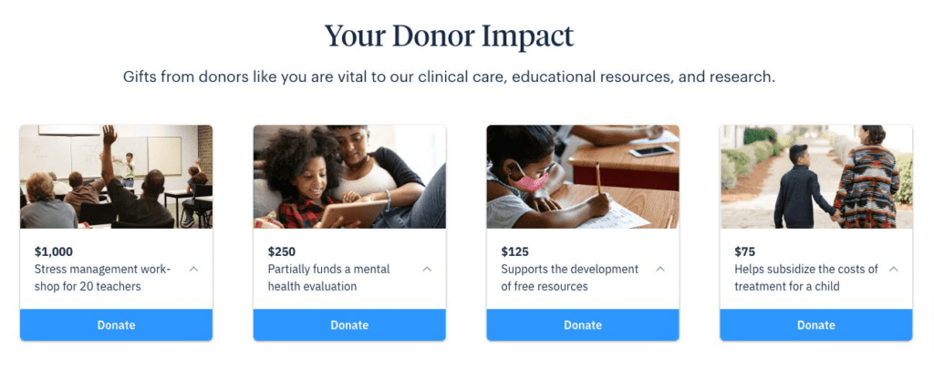
A great example comes from the Child Mind Insitute which is focused on protecting the mental health of children and families.
In the above example, donors are given a few contribution options. Much like choosing between different products, users are given the freedom to understand each option and find the best fit for their intentions. The options put users in control, and makes them feel good about their choice.
Example #2: Charity Water
Another great example comes from Charity Water.
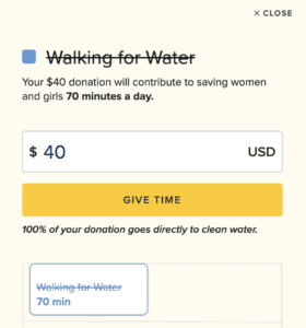
Their mission is to bring clean and safe water to people around the world. A recent campaign labeled “End the Walk” focuses on the time spent by women fetching water in different countries around the world.
Their website presents visitors with the opportunity to engage in impact giving by tying a donation amount to the number of minutes saved by a woman who would otherwise have had to walk.
Here, Charity Water is saying that for $40 USD, donors can save a woman 70 min of time by not having to walk for her water. It’s a powerful way to entice donors and appeal to their emotions.

Charity Water completes this exceptional donor experience by showcasing the direct impact of a donation on the confirmation page.

3. The importance of optimizing the checkout experience
According to the Baymard Institute, the average e-commerce site can gain a 35.26% increase in conversation rate through better checkout design. Across the US and the EU, this accounts for $260 billion dollars worth of lost orders. Though there are several reasons why people opt out of a purchase at the last minute, there are a few common variables:
- Lack of scannability, readability, or usability
- Slow load times or processing times
- Concerns about secure transactions
These issues are not just specific to the e-commerce world—nonprofits are susceptible to the same type of abandonment issues. Improving the “checkout” process for potential donors—like improving the check out process for consumers—will increase revenue via online fundraising.
Here’s how nonprofits can do it:
Include fewer form fields
Research shows that the average checkout form has 11.8 fields. With so many fields comes a lengthy checkout process—one of the main reasons consumers abandon a shopping cart. So to improve conversions, the number of form fields needs to be reduced. To do this, consider:
- What information is mission-critical for us to capture at checkout and what info is not?
- What fields can we condense?
- What fields are burdensome to users, and how can they be made sleeker and more user-friendly?
- What fields are confusing to users and cause frustration?
Create a cleaner layout
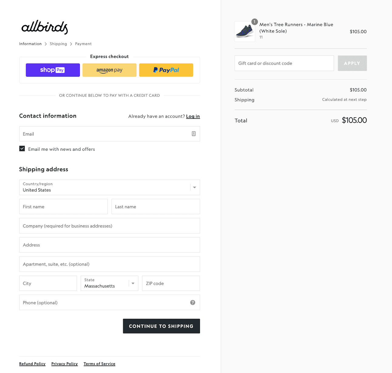
Imagine you’re in the market for a new pair of running shoes. You’ve heard of a brand that has a great reputation and you’ve navigated to their website and added the desired pair of shoes to your cart.
Example #1
Example #2
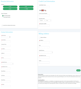
Now image instead of being presented with Example #1, you’re presented with the following checkout form (we had to break it up into two screenshots; it was so long).

Put yourself in the shoes of the user and ask yourself the following questions:
- Am I disappointed by the quality of this experience?
- How different is this from the quality I expect from most shopping experiences?
- Do I trust this website with my information?
- Do I believe this is a serious and reputable organization?
- Would I complete the checkout to buy the shoes?
The layout and orientation of your form can have a major impact on the experience of your users. By neglecting the design of a donation page, nonprofits can lose out on hundreds if not thousands of dollars in donations.
Integrate digital wallets
Payment methods such as Google Pay, ApplePay, and PayPal are known as “digital wallets.” In 2020, these payment methods made up almost 45% of e-commerce payments and by 2026, research shows that over 60% of the population will be using digital wallets for online transactions.
There’s a reason why digital wallets have become so popular: they’re quick and easy to use. Digital wallets allow users to skip many of the troublesome steps involved in traditional checkout processes and makes the process of transacting faster. Meaning, organizations that integrate digital wallet checkout options can bring in more donations.
Remove redirects
Imagine you are purchasing a pair of shoes online. You’ve browsed through the website, found the right size/color, added them to your cart, and now you are ready to checkout. You click the checkout button and all of a sudden you are sent to a third-party website. It’s likely that your immediate response is a combination of confusion and hesitation.
Many nonprofits do this sort of thing all of the time. Sending users to 3rd party websites for transactions is called “re-directing” and it can increase the abandonment rate during checkout. Here’s why:
- Re-directing can cause friction in the form of glitches and slower load times.
- People report feeling distrustful of organizations that redirect at checkout when being pushed to another website to process their credit card information.
- 3rd party websites often lack the same branding as the organization’s parent site which further disengages a customer from your product and story (for nonprofits, it disengages them from the organization’s ethos).
Keeping donors on your website to process donations is essential to reducing abandonment.
4. The importance of becoming mobile-friendly
As mentioned above, Millennials and Gen-Z will become the dominant force in philanthropy in the coming decade. And they’re doing it from their phones. According to Pew research Center:
- More than nine-in-ten Millennials (93% of those who turn ages 23 to 38 this year) own smartphones
- 95% of 13 to 17-year-olds have access to a smartphone, and a similar share (97%) use at least one of seven major online platforms
- The share of Americans that own a smartphone is now 85%, up from just 35% in 2011
Lengthy forms with poor user interfaces mean people seeking to donate via mobile have higher abandonment rates than people donating via desktop. Just like purchasing a consumer good on a phone, if users can’t donate easily and quickly from their phones, they might not donate at all.
Putting it all together: Assess your donation experience
Now that we’ve covered the main takeaways from e-commerce sites that nonprofits can use in their online fundraising efforts, it’s time to assess how your organization measures up.
Take a minute to review the way your organization’s donation experience by using the below resources:
- Friction Assessment
This tool helps to identify how much “friction” there is for users who are considering donating to your website. Answer the questions and get a quick score to see how much you can improve. - Elements of a Donation Page
This tool outlines the best practices of great general donation pages using an interactive live donation form.


