We recently analyzed every website on the Forbes list of the top 99 largest U.S. (except for one) nonprofits so that we could understand how these large organizations manage their websites.
What we found was pretty interesting (if you’re an absolute nerd for nonprofit web design that is).
In the following article, we’ll review the data we aggregated throughout this study, specifically looking at:
- What were the most popular website platforms used?
- What was everyone using for a donation tool?
- How did these nonprofits structure their main menus?
- How many words did these nonprofits use on their homepages?
- How did these nonprofits use video on their homepage?
- How many nonprofits provided search features on the website?
Top Website Platforms
Our first analysis was focused on the website platform of choice for this list of nonprofits. After carefully inspecting each website, we sorted through the data to present the following breakdown:
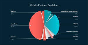
We found that WordPress was the most popular by far, followed by Drupal, and then Adobe Experience Manager.
Many platforms were only being used by a single nonprofit on the list such as:
- Wagtail
- Webflow
- Brightspot
There we also a few websites that were custom-built and therefore were not tagged to any website platform.
So… what does this tell us?
For one, be careful about belonging to an army of one. If your nonprofit website is on any of the low-percentage platforms identified in this list, you may be in for a challenging future.
In our experience over the years, platforms that are heavily used survive, grow, and take market share from the smaller platforms. Just like plants growing in the shadow of a larger tree, the smaller platforms therefore have to discontinue support for their products and eventually shut down.

This can (and has) left many nonprofits stuck on a platform that continues to degrade over time.
If you instead build on a platform like WordPress or Drupal, you can ensure that the technology running your website will continue to be supported and enhanced going forward.
Having a larger market share means a larger ecosystem of tools, developers, and experts to assist you as your needs evolve. Smaller platforms will have a smaller ecosystem, therefore you may have a harder time of finding expert help when you need it.
Top Donation Tools
In the online giving category, there were a few heavy hitters that were frequently used on this list of nonprofit websites.
The most commonly used donation platforms that we found during our analysis are:
- Classy
- Blackbaud
- Fundraise Up
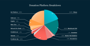
There were a large number of websites that were not using a platform to manage their online giving. Many of these websites are using custom-built forms, often integrated with a payment processor like Stripe, to process donations.
There are several reasons this might be:
- They don’t want to spend the extra money on a subscription or additional processing fees
- They have highly custom needs and are not able to find a tool that supports them
- They simply don’t see the value in leveraging tools for donations
We think this is a mistake.
For one, the companies behind the world’s best online giving tools bring together hundreds of researchers, developers, data analysts, and engineers all with the goal of building tools that enable nonprofits to grow their donations online.
You may have a great in-house team, but it’s unlikely that your team can bring the same resources to bear on the issue of online giving.
When you skimp on tools, you are also skimping on all of the expertise that is being poured into them.
Further, when you build your custom donation workflows to achieve certain needs or cut costs, you actually could end up spending more, in the long run, to roll out new features or to maintain your custom workflow over time.
Custom things break. Custom things take time (money) to develop. You’ll end up paying for it somewhere.
Top Tool Combos
As part of our research, we also wanted to know what was the most popular combination of tools used for websites + online giving. We wanted to understand if there was a combination that worked best for the nonprofits on this list.
The pie chart below includes any combination of a website and donation tool that was found to be used on more than 3 of the websites we reviewed.
Dozens of other combinations were found on 1 or 2 of the sites reviewed and these were left out of the analysis.
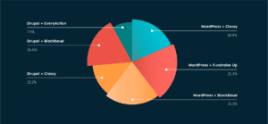
As you can see, it’s an even split for the most frequently used combo between:
On the WordPress side, the most frequently used donation platform alongside it was either Fundraise Up or Blackbaud.
On the Drupal side, it was Blackbaud.
What does this tell us?
It could mean that these larger nonprofits have found reliable tool combos and are moving away from building more custom arrangements with niche software.
As we mentioned above, as these platform combinations become more popular and gain greater market share, we could see the smaller players struggle to survive.
If you are using any of the tool combos highlighted above, chances are your website is set on the technology side of things.
Average Menu Options
We were surprised to find that even amongst the largest nonprofit organizations in the U.S., the average number of options in the main menu navigation was only 6.
Given the size of these organizations, we were surprised that they were able to keep their main menus so limited. The lesson for other nonprofits? If the big guys can do it, so can you!
Another interesting find when it comes to menu structure with these large organizations is the fact that the average number of dropdowns per main menu option was 8. So instead of providing a ton of top-level options, these organizations have decided to add more drop-down options to their navigation
Mega Menu: Yes or No?
As part of our investigation into the way these organizations set up their main menus, we wanted to see how many of these organizations present their options in a mega menu.
A mega menu goes beyond presenting pages in a standard drop-down list and expands upon item hover as shown below:
While these were more of a rarity in the past, we’ve seen an increasing number of nonprofit websites present mega menus.
Why?
If you have a lot of links that you want to provide access to via your main menu, using a mega menu can be better than a long drop-down list of links. These mega menus provide more real-estate for the use of whitespace, icons, and visual cues that might help visitors find what they are looking for.
Overall, we found that far more websites used mega-menus than we had expected. The chart below compares the number of sites that did use a mega menu versus did not decide to use a mega menu.
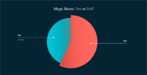
Based on the data, it’s possible to imagine that the use of mega-menus will be a standard practice for nonprofit websites in the next few years.
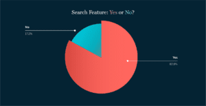
Search Feature: Yes or No?
A great way to help visitors find exactly what they are looking for on your website is by including a search feature in the main header area.
We found that a search box on the homepage was on over 80% of the 99 sites we reviewed. Of all of the website features we reviewed as part of this study, having a search feature was the most consistent, with 82.8% of websites including one.
It makes sense.
Search features are not only great ways of getting your visitors exactly what they need (if done well), but they are also great tools for learning more about what your audience is seeking.
Everything typed into your website’s search bar can be tracked, recorded, and counted. This data is a portal into the needs of your visitors. If they are typing it into your search bar, it’s either:
- very important
- hard to find on your site
- all of the above!
Try to review this data every quarter to ensure that you are presenting the most relevant and important content to your visitors.
Videos on the Homepage: Yes or No?
While we were not surprised to find that almost 75% of the websites reviewed did not have a video on the homepage, we were still a little disappointed (which is always worse, isn’t it?).
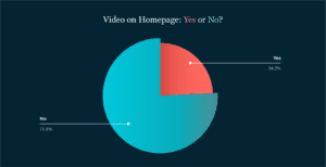
After the search feature, not having a video on the homepage was the other most consistent finding from our study.
Videos are such great tools for showcasing your mission and engaging with visitors that it is a shame that more organizations (especially large ones with bigger budgets) haven’t invested in producing them. Especially given the fact that videos are one of the most powerful content formats for engagement!
This could be a big opportunity for smaller nonprofits to stand out with their websites. Invest in a high-quality video for your website homepage and you could be one of only a handful in your area to do so.
Magic Word Count: 649
That’s it! The average word count on the homepage across the 99 websites we reviewed was just 649.
What does this tell us?
This is another example of large organizations being very selective about the volume of content they present on their websites. For these organizations, trimming their homepage word count down to 649 involved making very strategic decisions about what not to include.
More does not necessarily equal better.
Summary of Findings
We presented a lot of data in this report. For the sake of simplicity, we’ve included a quick highlight reel with the key findings from the study to wrap things up.
- If you’re nonprofit is not using WordPress or Drupal, you’re in the minority.
- There’s a good chance that combining WordPress or Drupal with either Classy or Fundraise Up is a combination that will work for you.
- Keep your menu options to 6 and consider switching to a mega menu.
- Make sure you have a search feature available!
- If you want to stand out, invest in a great homepage video.
- Don’t get too wordy.