Developing effective content for a website is challenging. Visitors to your website spend less time reading the words on the screen than they do scanning the content for keywords and sections that they might want to dig into.
Most people won’t even read this article’s introduction. If you’re like most people, you’ve already started to scan down the page to find the 7 main points that the title of the article references.
Don’t lie! It’s okay. 🥲
Reading content off of a screen is different than any other medium. It’s not like reading a pamphlet, magazine, newspaper, or book. The Nielsen Norman Group, a firm focused entirely on user experience research online, puts it this way:
“Print is linear, author-driven storytelling. The web is nonlinear, reader-driven, ruthless pursuit of actionable content.”
Visitors want to guide the reading process themselves. They are here to pick and choose the sections and information that they find most interesting. They are not here to follow a narrative.
The key therefore to developing content that matches this medium is to avoid making some of the big mistakes we’ve outlined in this article. If you can make it easy for visitors to flow through your content in their “ruthless pursuit of actionable content”, then you’ll be well on your way to more web-friendly content.
1. Lack of focus
One of the biggest and most fundamental mistakes nonprofits make is conceptual.
Often, we see nonprofits treat their websites like they are external hard drives. With this perspective, the website becomes a place where you store any/all information that is coming out of your organization.
- New press release? Let’s put it on the website. 🔴 Nope
- Volunteer spotlight? Let’s get that on the website. 🔴 Nope
- Event photos? Definitely on the website right? 🔴 Still nope.
This dumping-ground mentality leads to difficulty answering the following core questions:
- What is our website here to do?
- Who is our target audience?
- What action should our visitors take?
Instead, it can be helpful to think of your website more like a museum. A museum is a highly curated and thoughtful selection of content that is aimed at conveying a specific message or evoking a specific emotion from the visitors.

Museums don’t put out all of their content on the floor at once. Like an iceberg, most of their material is under the surface… like literally in the basement.
Nonprofits should approach their content with the same lens of curating rather than uploading. If you constantly find yourself creating new sections and new pages for content that you want to get onto your website, you may have a curation problem.
Imagine if the Louvre put all of their material on the museum floor at once. It would be an overwhelming mess. It would be impossible to appreciate or even notice some of the finer works when they are mixed into this sea of content.
The same goes for your nonprofit website. You may have some excellent content on your website, but it may be lost on the visitor because it’s mixed into everything else.
Okay, so what can you do?
Solution: Perform quarterly content audits.
Try to match every page of your website to both a desired outcome and a user persona. It will force you to bring focus to all of the messages on your site. If you can’t identify who the content is for and what you want them to do with it, lose it.
2. Too wordy
According to the user experience research firm, Nielsen Norman Group, users only read about 20% of the words on any given page.1
With this in mind, it’s critical to be very selective with the number of words you present on your website to ensure that the 20% being read are the most important and have the greatest impact on the visitor.
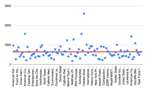
We recently studied the websites of the 100 biggest nonprofit websites in the US in 2022 (results to be published soon!) and identified the average homepage word count across all 100 sites.
The magic number?
649 words.
If some of the largest and most successful organizations can get the message across with less than 700 words, then so can your organization!
Here is the data in a scatter-plot from the study.
Solution: Try and take some of your most wordy sections of content and trim them down with ChatGPT. You can also use ChatGPT to enhance the language for engagement.
3. Lack of supporting visuals
Content needs visuals. Otherwise, it’s just big blocks of text. Plus, as the old adage goes, “a picture is worth a thousand words”.
One of the most effective ways of improving engagement on your website is to enhance the quality of your visuals. There are a few core types of visuals that all nonprofits should be using to enhance their content:
- Infographics
- Charts
- Pictures of people
- Video testimonials
- Timelines
Why are visuals so important?
According to research, while people only remember 20% of what they read, they remember 80% of what they see and our brains can process images 60,000x faster than text.2,3
So, with everyone “ruthlessly” scanning your website, trying to extract some understanding, visuals can help you deliver that understanding in a much more efficient manner.
Consider the following example:
Text
Over the past 5 years, we’ve increased the number of meals delivered to children in the United States by 500%.
Visual
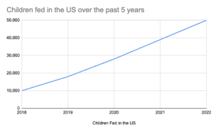
Both forms of content might say the same thing, but the chart is going to leave a more powerful impression and it will do so in a way that requires the visitor to do less work.
Solution: Before you publish something, always stop and ask yourself how this piece of information can be enhanced with a visual. Then log in to Canva and see what you can create on your own!
4. Not mobile friendly
Often, nonprofits present content on their website that may be readable on a big screen, but present major problems when the content gets squeezed onto a phone. Consider how the following text section presents itself on a desktop versus from a mobile phone:
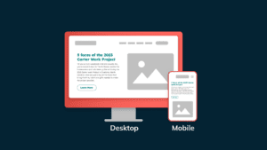
No matter how compelling the message is or how thoughtful the writer was, if visitors can’t read it, it doesn’t work.
This issue goes hand-in-hand with issue #2 above. When the content is too wordy, it has to get squeezed down to tiny font sizes on mobile, or else it has to take up a lot of space down the page as the user scrolls.
Solution: Make sure that on mobile, the smallest font size on your site is 20px, and don’t present chunks of text with more than 4-5 lines.
5. Poor scannability
According to research from the Nielson Norman Group, people read text on screens 25% slower than they would in printed format. This points to a general struggle with digital reading.
As a result of this increased workload for reading text onscreen, people report the experience as being generally unpleasant and try to get through it as fast as possible.
👀 They are scanning more than reading.
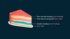
One of the scanning patterns identified by the Nielsen Norman Group is called the “Layer-Cake Pattern”.
This occurs when visitors scan the headings and subheadings and miss most of the content below those headings.
Take a look at the diagram below. The frosting represents the main headings of your page or article, while the cake represents the paragraph text. Most people are going from frosting layer to frosting layer, looking for keywords or phrases that make them want to dig into the actual “cake” layer below it.
There are a few key ways to help make sure that your “cake” is as scannable as possible for visitors.
Scannability Tip #1: Make headings descriptive and hierarchical.
The key to ensuring that your content is scannable is to ensure that your headings are descriptive and informative. Visitors want to know if the next section of cake (content) is going to answer their questions before they start reading, so you need to assure them that it will.
You do this by putting the most relevant keywords in the frosting. These keywords act like triggers for interest and will help readers triangulate what they are looking for.
Also, make sure that your headings create a visual hierarchy of information.
The most important, overarching idea should be the largest heading on the page, and your supporting ideas should be smaller subheadings; just like they taught us in grade school!
Scannability Tip #2: Create Visual Groupings
Take a look at the example below. Both sections highlight the same information, but which one is easier to engage with?
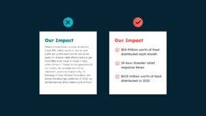
The design on the right has simply taken the same core data points from the example on the left, but it’s removed all of the fluff, turned it into a list format, and added simple icons to help people distinguish each data point from the next.
All we did to make this content easier to scan was turn it into a list. Lists are great examples of creating a visual grouping of content that is more easily scannable by visitors.
Other ways to group content visually are to add borders to them or to add special background colors to grouped content.
Scannability Tip #3: Use whitespace
Another way of making it easier for visitors to scan your content is to provide their visual field with some breathing room.
Whitespace simply means adding blank real estate between your different content sections. This technique makes your content more visually appealing to the visitor, which makes them more likely to spend time scanning through it.
We’ve all landed on very crowded websites and felt the friction involved with trying to dig into the content and understand what they are offering.
Consider this piece of content (if you’ve read this far).
We aren’t just adding white space between paragraphs, but also ideas and sentences. If it’s really important, we want it to stand out. The best way to do that is to give it some real estate of its own.
6. Lack of compelling CTA
Having compelling calls to action is one of the most important aspects of building successful nonprofit websites. After all, action is the clearest way to see ROI from your website investment, so driving people to take action is mission-critical.
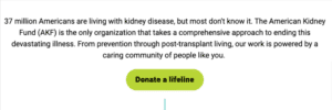
Consider the following example from the American Kidney Fund
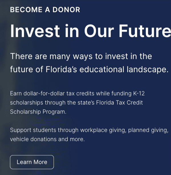
Now compare this with an example from Step Up for Students, an organization that empowers Florida students with scholarships for personalized learning.
Which CTA is more compelling from your standpoint?
Not only does the CTA from Step Up for Students lack contrast (a design issue), but the language being used is vague and uninspiring.
The example from the American Kidney Fund stands out from the page and provides much more compelling language for inspiring action.
Solution: Find any CTA on your website labeled “Learn More” and work on finding a better, more descriptive & more compelling choice of words.
7. Lack of defined tone
Tone is defined as
the general character or attitude of a place, piece of writing, situation, etc.
Many nonprofits spend very little time considering their use of tone in their website content. Many see tone as an unnecessary element of website content, or as something that emerges spontaneously during the writing process.
But the tone of your content is the way your nonprofit communicates how it feels about its mission beyond the mission statement. Do you approach your mission seriously or with humor? Are you presenting a formal tone to your visitor or are you taking a more casual approach?
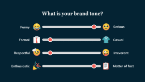
The Nielsen Norman Group has identified 4 key dimensions of tone that first need to be defined before diving deeper into the specifics of word choice. These four dimensions are:
- Funny vs Serious
- Casual vs Formal
- Respectful vs Irreverent
- Enthusiastic vs Matter of fact
Start by assessing where it makes the most sense for your brand to be across each of these different dimensions as this will help to drive the development of your content to align with this tone.
By not having a defined tone for your content, you may end up with many different ones, especially if you have multiple authors contributing to your content.
Great website content is not “cut & paste”
Often, nonprofit leaders see the website content process as a simple cut & paste from their other marketing materials.
This is a huge mistake.
Your annual reports, presentations, mailing campaigns, and other print material will not work on your website in their existing formats. It takes work to repurpose content for its intended medium.
The key is to match your content to its medium, and in the case of websites, it means avoiding the big mistakes we’ve outlined in this article.
Hope it was helpful!
😁
1https://www.nngroup.com/articles/rewriting-content-brevity
2https://www.t-sciences.com/news/humans-process-visual-data-better
3https://www.emailaudience.com/research-picture-worth-1000-words-marketing/