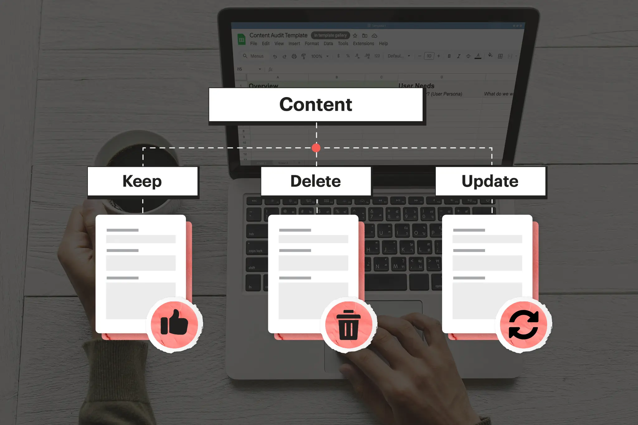
Why audit your content?
Human nature says it’s always easier to acquire new things than to eliminate old ones.
Some primordial, survival-based drives keep us clinging to the old longer than we should and continuing to add new when unnecessary.
(Meghan, my love, can we tackle our closet one of these days?)
Besides being a phenomenon visible in my wife’s closet, you can see this on many nonprofit websites.
Marie Kondo and museums
In homes and closets, we have Marie Kondo to save us from ourselves.
In the world of websites, we have a content audit.
The purpose of a content audit is to force us to confront all of the information haphazardly added to our websites. Many nonprofits believe that new information should, by default, be included on our websites.
Defaulting to yes with new content is a bad strategy. We should be defaulting to no.
New content shouldn’t make it to our websites unless we can provide a compelling reason. Many nonprofits view their websites as external hard drives, a place to upload content for storage and presentation.
It’s time to re-frame this perspective.
Your website isn’t a hard drive; it’s a museum.
A museum is a thoughtfully curated collection of information designed to leave an impression and impact the visitor. Museums keep most of their stuff in the basement; they don’t put everything on the museum floor.
Imagine the chaos if they did!
Defaulting to yes with new content is a bad strategy.
Preparing your content audit
So, you’ve decided to tackle the challenge of performing a content audit on your nonprofit’s website.
Great. Godspeed.
First, we need to provide you with some useful tools and guidance on how to tackle this project effectively.
Because it is a serious project.
Gather your council
A nonprofit website content audit is not something that you should take on alone.
Your website serves the needs of various types of users, and you are likely not the expert in all of them.
Further, your website may serve the needs of some of your internal staff, and if you plan on making changes, their voices should be heard, too.
Consider gathering 2-3 colleagues for this project so that you can ensure a diversity of perspectives. Don’t make your group larger than that because…well, you know why.
Get your tools for the job
The spreadsheet template
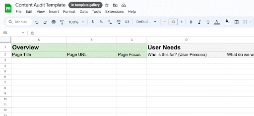
A well-organized spreadsheet is a thing of beauty.
Here, we’ve designed a Google Sheet template that is broken down into three smaller sheets for each step in the content audit process.
This sheet also has many formulas for the audit already built in.
Make sure that before you keep going, you download the template using the link below!
Download the template
The sitemap extractor
Next, you’ll want an efficient way to import the URLs from all of your website’s pages into the spreadsheet for review.
You could go page by page and copy and paste the URLs into the spreadsheet (you could also just go ahead and put hand sanitizer in your eyes), or you could use a tool like SEOWL to extract the URLs and convert them to CSV for uploading to Google Sheets.
All you have to do is go to www.seowl.co/sitemap-extractor and input your website URL as follows:

If your website doesn’t have an XML sitemap, you’ve got another issue. You can read more about that with this great article by Yoast SEO.
Assuming your website IS setup with an XML sitemap, you should then get a list of page results like the following:
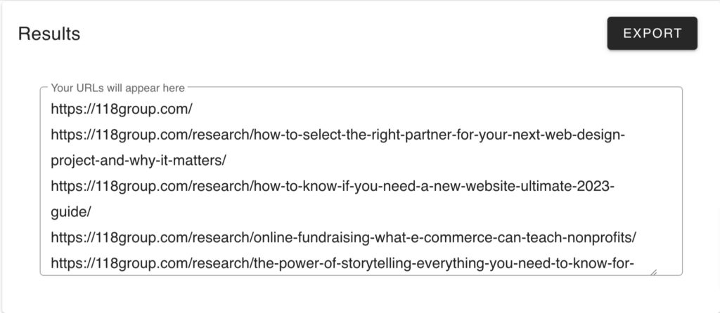
Then, all you have to do is export the files to CSV and import them into the “Page URL” column of your audit spreadsheet, as shown below:
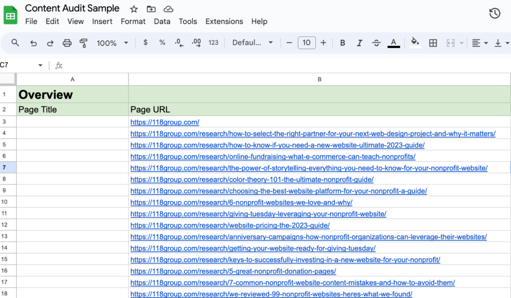
You may have several “extra” pages as part of your sitemap that aren’t relevant to this content audit. If that’s the case, delete them!
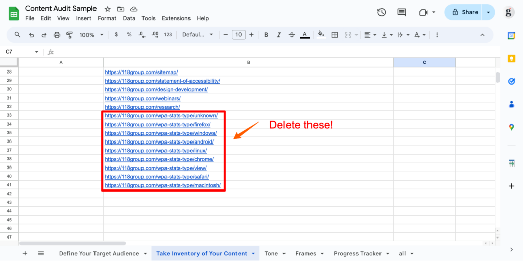
Okay, great, now you have all your web pages neatly organized in your handy-dandy spreadsheet.
Google Analytics
If your nonprofit is making decisions about what content to prune, then it helps to have some data about page performance.
The goal is to prune the bottom 30% (roughly) of your pages in terms of performance based on a few key metrics:
- Views
- Average Engagement Time
- Bounce Rate
- Average Session Duration
You’ll need at least three months of data in your Google Analytics account to perform this audit.
As part of the audit preparation, you’ll want to export a performance report that captures the following key performance indicators (KPIs).
- Views
- Average Engagement Time
- Bounce Rate
- Average Session Duration
To do this, log in to Google Analytics and go to “Reports>Engagement>Pages and Screens.”
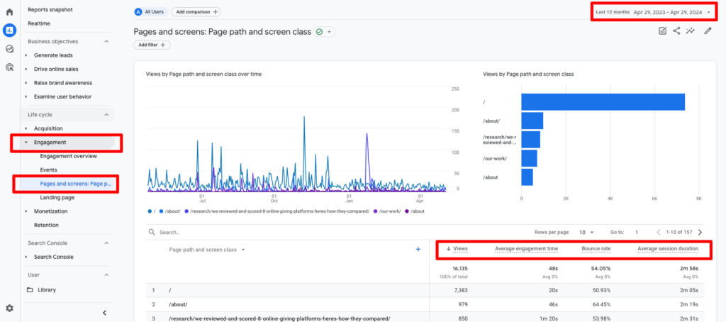
In the screenshot above, you’ll notice that our report shows the performance of the KPIs we’re evaluating in our spreadsheet. You’ll also notice that we are exporting 12 months of data—the more, the better!
If your report view is not showing the metrics outlined above, you can customize which metrics are presented by selecting “Customize Report” in the top right menu area as shown below:
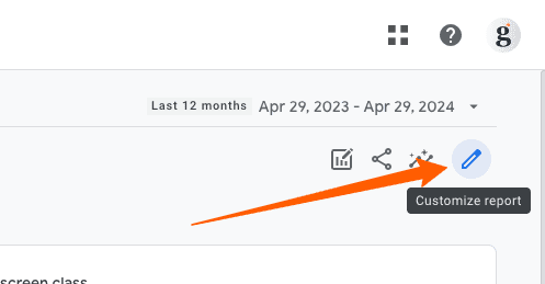
Once selected, a window will appear with the option to customize which metrics are being pulled into this report.
Select “Metrics” and then ensure that you are pulling in the same metrics as shown in the screenshot below:

Once this is done, you can export the report by clicking on the “Share this report” button in the top right menu and selecting “Download File” as shown below.
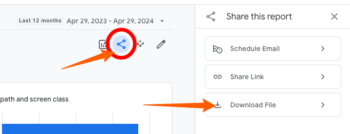
When prompted on the next screen, download the file as a CSV, and we’ll be ready to import it!
The audit process
Define your users
No matter how good your steak is, if you serve it to a vegetarian, you’re not going to make any friends.
The key to great content is that it aligns with the people in your target audience.
That’s why the first step in the content audit process is to define the user archetypes for whom you are crafting content.
Identifying your archetypes
A user archetype represents a cluster of your audience with similar behaviors, attitudes, motivations, and goals.
For example, a typical archetype for a nonprofit could be a First-Time Donor or Potential Volunteer.
The key is to start organizing your website visitors into groups with similar motivations, pain points, and interests.
Nonprofit websites typically have a more diverse set of user archetypes than other websites because their audience has a diverse set of needs and motivations.
Common archetypes for nonprofits include:
- The Donor
This user wants to understand the impact of their donation and why they should support your cause. They are looking for transparent financial and impact data. - The Volunteer
This user is looking for an organization to dedicate time and skills. They want to know what opportunities exist for volunteers. - The Advocate
This user wants to raise awareness and influence policy related to the nonprofit’s cause. They seek rich context, statistics, and educational material. - The Client
If a nonprofit provides services, this is the user who needs the nonprofit’s services and programs and is looking for information and a way to get in touch.
These archetypes can be more nuanced if necessary.
For example, the archetype for a user who is a potential first-time volunteer with your organization would be different from that of a volunteer who has been an active volunteer with your organization.
The key here is to start small. This audit is meant to clarify your content, but it should not serve as the last exercise in evaluating your website content.
The key is to start organizing your website visitors into groups with similar motivations, pain points, and interests.
Understanding their motivations
The next step in the content audit is to spend some time articulating the motivations of each archetype as it relates to the website.
In the content audit template, we prompt you to answer questions such as:
- How did they come to the website?
- What problem are they trying to solve?
- What content would we include if we could only build one page for this archetype?
- What are the most important questions we want the website to answer for this archetype?
- What is the most important action we want this user to take on our website?
Let’s take a look at an example of a typical Volunteer archetype.
- How did they get to your website?
They probably follow us on social media and clicked a link to get to our website. - What problem are they trying to solve?
They are looking for a meaningful way to spend their time. They might be looking for opportunities to connect with like-minded individuals. - What are the most important questions we need the website to answer for this archetype?
What will I be doing as a volunteer? How much of a time commitment is expected? Are any special skills required? - If we could only build one page for this persona, what would we include on it?
Describe volunteer opportunities along with their requirements—photos of other volunteers connecting. - If this archetype could only take one action on the website, what should it be?
Sing up to volunteer!
Why does this matter?
Our user archetypes and their respective motivations are the lenses through which we will evaluate the content on our website.
If it doesn’t help one of our user types address these core motivations, it’s unnecessary and adds clutter to our design.
Once you’ve repeated this exercise for all of the different archetypes identified previously, we are ready to move on to the next phase of the audit.
Import your performance data
At this point, you should have extracted your sitemap and added the URLS of all the relevant pages of the audit into your spreadsheet. Further, you should have a report of your performance across our desired KPIs downloaded and ready for import.
We plan to import the data into the sheet labeled “GA Data Import” as shown in the screenshot below:

To import the data into the sheet we’ve already formatted, select cell A2, go to “File>Import>Upload,” and select the file from your computer.
Then, when prompted to select an import method, choose “Append to current sheet” as shown below:
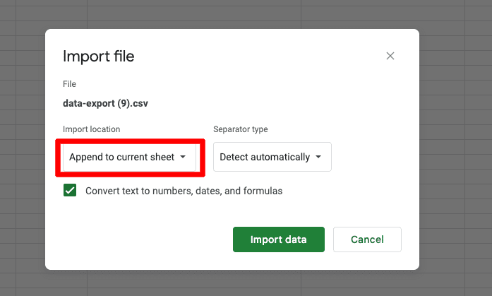
This will ensure that we aren’t the current sheet template.
Your import looks funky at first because it contains some extra data from Google Analytics. It will likely look like the following:
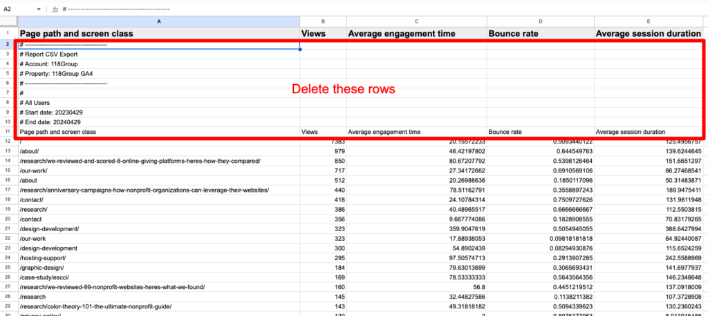
You’ll want to delete the extra rows (2 – 11), as shown in the screenshot above.
Once that is done, your spreadsheet will look like the following.
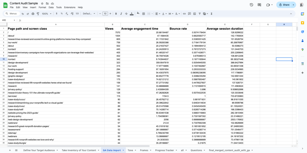
If our spreadsheet works properly, some magic should have occurred in the “Content Inventory” sheet after you imported and cleaned up the Google Analytics data.
Your performance data for the four desired KPIs should be correctly mapped to their respective columns in your “Content Inventory” sheet and color-coded according to their relative performance.
- Red means it is performing poorly compared to the other pages in the list.
- Yellow means it is in the middle of performance compared to the other pages in the list.
- Green means that they are scoring well compared to other pages in the list.

Now that you’ve defined your user archetypes and set up your sheet with your relevant URLs and their respective KPIs color-coded by comparative performance, you’re ready to switch to the fun part of the audit.
The conversation.
Evaluate
You’ve imported your website links and their respective Google Analytics data into the master spreadsheet.
Fantastico.
It’s time to start combing through this information for insights and ideas.
Remember, with a content audit, one of the key questions we want to answer with each page in our inventory is whether we should keep, delete, or update.
User Needs
Start by focusing on the “User Needs” section of the sheet. The point here is that all of your website’s content should satisfy the needs of one or more user archetypes.
Go page-by-page and ask yourself the question:
“Who is this for?”
This piece of content may be unnecessary if you don’t have a clear answer that maps to one or more archetypes you’ve identified earlier.
That page you built for an event last year no longer serves your users.
Delete.
That page you built for a program you ran once in 2021 isn’t serving any of your users.
Delete.
A good pruning can feel ruthless. You should remove roughly 30% of your existing pages. While this may seem aggressive, removing these unproductive pages means traffic will fill into the areas of the site that serve a purpose, as evidenced by the User Needs section of your sheet.
To stay organized and visualize the amount of content you are pruning, tag each page with its appropriate “Action Needed” tag in the “Next Steps” area of the sheet.
Best Practices
This next step in the audit will force you to confront the quality of the content you present to the world.
It is painful but necessary.
If you’ve written most of the website’s content, objectively grading its quality can be difficult. It’s written in your writing style, which means you will have a hard time seeing its flaws.
This is where a few tools can help you examine your writing objectively.
The Hemingway Editor is a tool where you can paste your content into the editor, and it will grade your content’s readability based on a set of widely accepted principles.
Another useful tool for objectively reviewing your content is ChatGPT. Try pasting some of your content and asking it to evaluate the scannability or readability of your work.
The great thing about ChatGPT is that it can give you feedback on your current content and help you rewrite and improve it.
If you’re unsure what the best practices for scannability are on your nonprofit website, check out our article about common nonprofit content mistakes.
The last column in this section is “Word Count.” Plenty of tools exist to do this for all your site’s pages. The point of documenting a page’s word count is to show you that maybe that page you drafted for a recent volunteer testimonial that has 125 words on it could be deleted or merged with another page.
Performance
Given that you’ve already color-coded your performance data, this step should be the most straightforward and useful.
If that page you thought was really important is highlighted in red across all four metrics, you may need to remove it.
If a page doesn’t meet a user’s need and has a high bounce rate…, it might be time to say goodbye.
Conversely, you may have a green page with a high average engagement time and average session duration but low views. In this case, it’s possible that this page is helpful but isn’t prioritized in the main navigation.
You could have a green page for views but with a low engagement time and no clear user archetype associated with it – perhaps it gets too much of a priority in your main navigation.
It’s also possible that some of your site’s pages map to a user archetype, but due to poor best practices, these pages score poorly on performance.
As the website owner, you must evaluate each page across all three areas to get a full sense of what might be happening here.
Next Steps
The final section of the sheet, “Next Steps,” is meant to help you stay honest. To complete the audit, you must decide whether to delete each page, merge the content with another page, or update the content to follow best practices.
The final product of this entire process should be a new sitemap for your website.
A sitemap that is free of clutter and unnecessary pages. A sitemap that prioritizes the pages that matter and gets rid of the rest.
Open up a tool like GlooMaps and start mapping what your site should look like based on your findings from the audit. Or, bring these findings to your web team and ask them how they think it might affect the site’s navigation.
Either way, you should now have a clear picture of what is relevant and important on your website, which will help you prioritize the things that really matter!
