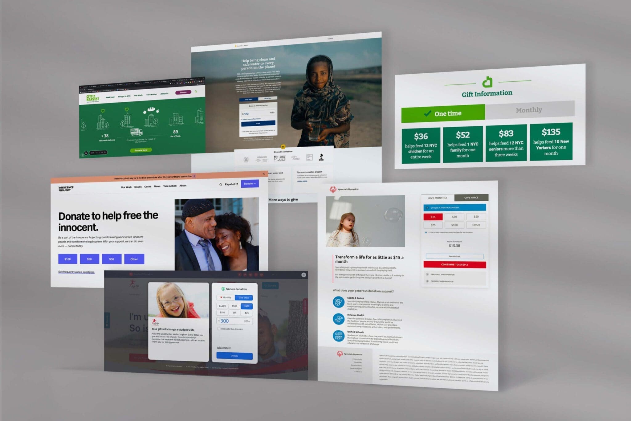
Donation Page Design Matters
“Good design is harder to notice than bad design,” writes Don Norman, author of The Design of Everyday Things. Why? Because when design works, it feels invisible — helping us accomplish what we came to do without getting in the way.
The same is true for online giving.
The best donation pages feel effortless, while the worst add friction — costing nonprofits millions in lost gifts every year.
To show what good looks like, we’ve highlighted 5 nonprofit donation pages that stand out. Each one offers practical lessons your organization can apply to make giving simpler, more compelling, and more effective.
What makes a great donation page?
After digging into donation pages from some standout nonprofits, a few things kept popping up:
No distractions: Hiding navigation keeps people focused on giving.
Emotion matters: Strong images and a clear, mission-driven message help donors feel connected and inspired to give.
Less friction = more donations: Keep it simple. Breaking forms into steps or using preset amounts can help people follow through.
Lead with impact: Show the difference a gift makes right away. When people see it matters, they’re more likely to complete the donation.
Download the Great Donation Page Checklist
Ready to see how your donation page stacks up? This simple, practical checklist helps you review your page, spot quick wins, and make changes that inspire more giving.
✅ Get the Free ChecklistNow, lets dig into a few great examples of donation pages that convert!
charity: water

What we like
If you’re running a nonprofit and you haven’t looked at the charity: water website, do yourself a favor and check it out now. We believe it’s a masterclass in great design, compelling storytelling, and smart technology choices for maximizing impact.
We’ve referenced their site a lot over the past few months, like in our article covering nonprofit websites we love, but for this article, we are zooming in just on their donation experience.
The charity:water donation page follows the same key principles from the rest of their site: powerful imagery, data-driven storytelling, and smart technology choices. ,
Why it works
- Impact data: clear demonstration of donor impact drives engagement
- Low friction: only essential fields appear, reducing drop-off.
- Compelling context: a strong image + 2–3 clear sentences make the ask feel urgent and meaningful.
Lesson for your nonprofit
Simplify to increase completion. Remove non-essential donation form fields and pair a powerful image with a concise impact statement. Every extra click costs donors.
Special Olympics

What we like
While the Special Olympics website doesn’t “wow” in terms of its aesthetic and design treatment, it excels in terms of best practices and accessibility.
Its donation page is no exception.
Images of children always work on a donation page, and the Special Olympics couples that with a clear, data-driven appeal ($15 a month can transform a life) and a multi-step checkout that doesn’t overwhelm potential donors.
Why it works
- Impact data: clear demonstration of donor impact drives engagement
- Multi-step checkout: breaking up the donation checkout reduces drop-offs.
- Compelling imagery: a strong image + 2–3 clear sentences make the ask feel urgent and meaningful.
Lesson for your nonprofit
Implement multi-step checkouts. Breaking up the checkout into steps rather than long forms improves donor conversion rates.
The Innocence Project

What we like
The Innocence Project brand is built on being bold, moving, and provocative. It’s mission to free the innocent is morally compelling and its website makes visitors stop in their tracks.
Their donation page highlights this strategy perfectly.
The video on its donation page highlights deeply personal stories of those wrongfully convicted, and its call-to-action “Donate to Free the Innocent” is hard to ignore.
Lastly, they avoid overwhelming the visitor with long form fields and instead present simple donation presets as a way of starting the checkout experience.
Why it works
- Powerful video: drives emotional connection.
- Low-friction donation pre-sets: makes it easy to start the donation process.
- Strong messaging: compels the user to act with user-centric language.
Lesson for your nonprofit
Pair a powerful, user-centric call-to-action with strong video to drive an emotional connection to your cause.
Step Up for Children

What we like
Children-focused causes always benefit from the power of images. When your mission is to help kids, and you can couple that with photos of children, it usually strikes a chord in anyone with a heart.
Step Up for Children couples strong imagery with a great donation experience.
The donation pop-up window helps avoid donor drop-offs (inevitable whenever you link to a separate page), and their donation platform presents a clean and simple checkout experience powered by Fundraise Up.
Why it works
- Donation pop-up: no redirects makes giving fast and frictionless
- Easy recurring giving:increases likelhood of monthly donors.
- User centric language: puts the donor at the center of the story.
Lesson for your nonprofit
Consider a donation pop-up to reduce the friction of redirects. Put the donor at the center of the story.
Feeding America

What we like
The donation page for Feeding America highlights several key practices that drive higher conversion rates for nonprofits.
For one, they have a very clear impact metric, $1 = 10 meals, which communicates a high value return for donors. If I can donate $10 and provide 100 meals, I’m going to feel pretty great about that investment.
Second, they highlight a current matching opportunity that drives the value of a donor’s investment even further. Now I can donate $10 and provide 200 meals, which feels like a no-brainer.
Lastly, their step-based checkout experience prevents users from being discouraged or overwhelmed when it is time to make a payment.
Overall, a great display of how to build a high-conversion donation page.
Why it works
- Clear impact metrics: adds transparency and credibility increase donor trust.
- Matching gift: provides additional incentive to potential donors.
- Step-based checkout: reduces donor overwhelm during checkout.
Lesson for your nonprofit
Try and present clear impact data for various donor amounts. Highlight matching opportunities front and center on donation page.
The Orangutan Project

What we like
Besides just finding Organgutan’s incredibly cute, there is a lot to like about this donation page.
They lean into imagery that everyone can connect with, an orangutan peering through a crate or box. They also provide a sense of urgency with their messaging, along with a direct appeal to the visitor.
“Orangutans Are in Crisis – They Need You Now”
Finally, they’ve productized their donation levels so that donors know exactly what their investment is purchasing for this cause.
Well done!
Why it works
- Productized donation levels: provides a true sense of what a donation "buys".
- Urgent & user centric messaging: makes the issue immediate and personal to the visitor.
- Strong imagery: stops visitors in their tracks!
Lesson for your nonprofit
Try and productize your donation levels to make it very clear what each donation level can do for your cause.
Ready to Improve Your Donation Page?
A well-designed donation page isn’t just about looks — it’s about reducing friction, building trust, and inspiring donors to act. The best nonprofit donation pages all share a few core elements, and now you can bring those same strategies to your own site.
Download the Great Donation Page Checklist
Ready to see how your donation page stacks up? This simple, practical checklist helps you review your page, spot quick wins, and make changes that inspire more giving.
✅ Get the Free Checklist