In a digital world, where attention is in short supply, a well-labeled website navigation can be the difference between an engaged user and a lost one.
Your navigation serves as the foundation of your website’s user experience. It tells visitors what you do, what is most important to you, and what actions you expect your users to take.
A well thought-out menu is a thing of beauty. It’s easy to scan, easy to understand, and doesn’t overwhelm visitors with information or options.
On the flip side, we’ve all interacted with menus that overwhelm visitors rather than guide them. Whether its a presenting confusing or unclear menu labels or simply having too many options to choose from, a clunky menu is an instant signal to visitors that their experience on your site could be challenging.
We analyzed 1,000 menu labels
We set out on a quest to examine the menu choices made by the 100 biggest nonprofits in the United States.
That’s crazy. Why would anyone do that?
Trendsetting
The law of familiarity is one of the most important things to consider when planning a website UX. This law essentialy states that people tend to prefer things that are familiar to them.
When it comes to website UX, it means that people tend to have an easier time engaging with websites that behave similarly to other websites they’ve engaged with in the past.
If 100 of the countries biggest nonprofits are setting the standard for navigation labels and main menus, instead of trying to present novel experience to our visitors, we might be better off presenting experiences that mirror those that our visitors are having on other websites.
Making the complex – simple
The other benefit of looking at the countries biggest nonprofits is that it can help us to understand how large organizations with large amounts of information to present to users organize their websites for ease of use.
Many of these nonprofits have dozens of locations, programs, and target audiences, yet they still manage to present a simple menu for visitors to engage with.
We want to know how – and we want to make it clear to smaller organizations that we don’t need to have 10 menu items.
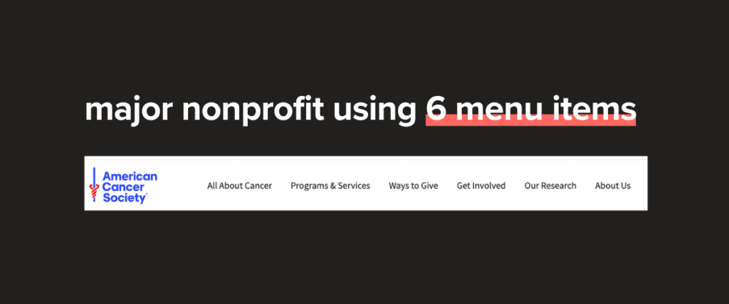
If the American Cancer Society can keep their menu to 6 items, so can you.
The basics of website navigation
Before we dig into the findings, it’s important that we set the scene by quickly presenting some of the basics of website navigation.
Types of navigation
A website may contain multiple types of navigation. This can includethe primary navigation, secondary navigation, footer navigation,, and breadcrumbs.
Primary Navigation: This is the main menu. It presents the most important links on the site and serves as the primary method of navigation for most users.
Secondary Navigation: The secondary navigation provides access to less-important links. This can live in the header alongside the primary navigation.
Footer Navigation: The footer often houses additional links that are not important enough for the primary or secondary navigation, but still need to be accessible to users.
Breadcrumbs: Breadcrumbs are like little landmarks that can live at the top of each individual page. It shows the path a visitor has taken to get to their current page.
Types of menu labels
A website navigation consists of a set of labels. Typically, these labels fall into the following categories.
Information-focused labels: Labels that provide visitors with background or context about the type of content found via this navigation.
Common examples include “About,” “Programs,” & “Events.”
Action-oriented labels: Labels designed to prompt users to take specific actions, such as donating, volunteering, or signing up for an event. These labels are typically verb-based.
Common examples include “Get Involved,” “Donate,” & “Take Action.”
Mission-focused labels: Labels that connect directly with the organization’s work.
Some examples include “Empowering Kids,” “Alzheimers & Dementia,” & “Fighting Hunger.”
Word count in menus
Monograms: A monogram is a single word or term used as a standalone navigation label. Examples include;
“Donate”
“Programs”
“Volunteer”
Monograms are concise and easy to scan, which makes them ideal for smaller screen sizes and minimalist designs.
Bigrams: A bigram consists of two consecutive words used together as a navigation label. Examples include;
“Get Involved”
“About Us”
“Give Blood”
Bigrams provide slightly more context than a monogram and often include a verb as part of an action-oriented label.
Key findings from our review
The magic number
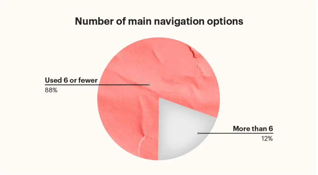
The average number of menu options per organization across the dataset was 6. This means that some of the country’s largest nonprofits can organize their websites using just 6 main labels.
In fact, 88% of the 100 largest charity websites in the US used 6 or fewer main navigation labels. So, if you’re using more than 6, you’re doing it wrong.
Why 6?
Miller’s Law
Miller’s law states that the human brain can only process a limited amount of information simultaneously. This is also known as “the magical number seven, plus or minus two.”
Keeping your main navigation options to 6 or fewer reduces the amount of information a visitor needs to process and make judgments on.
Example: Food Banks
Take a look at the following two lists. Both come from the main navigation of Food Banks operating in the United States.
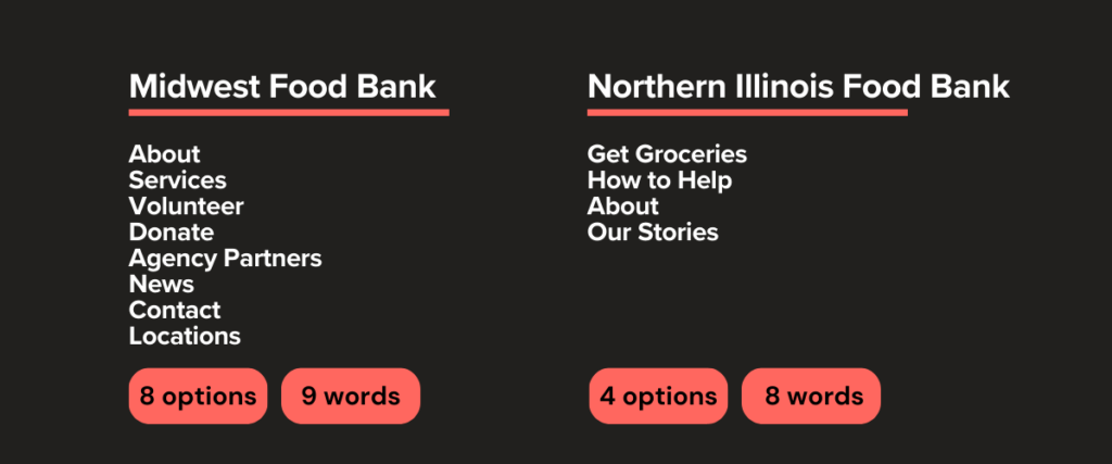
While both are essentially trying to achieve the same thing with their website; provide services and capture donations, the Northern Illinois Food Bank (NIFB) is able to streamline their content to simplify the user experience.
Instead of providing links for donations and volunteers, NIFB groups all its appeals for assistance under “How to Help.”
They also focus on action-oriented labels such as “Get Groceries” and “How to Help” instead of the information labels used by the Midwest Food Bank.
Which feels more compelling?
Example: Health Advocacy
For our next example, let’s look at the main navigation labels used by The American Heart Association and the Alzheimer’s Association.
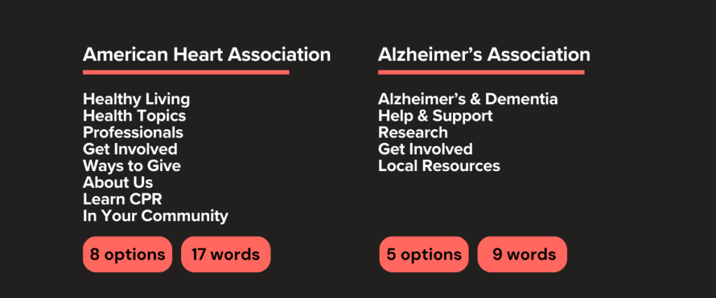
The AMA provides more options and more language to process before visitors decide where to go next.
When structuring your main menu, it’s important to consider not just the number of options you are presenting, but the number of words that visitors must process.
But what if I just have a lot of important links to share?
This is where the beauty of the mega menu comes into play. You’ve likely encountered many mega-menus when browsing websites, but essentially, they’re a type of menu that presents pages in large-format, drop-down windows.
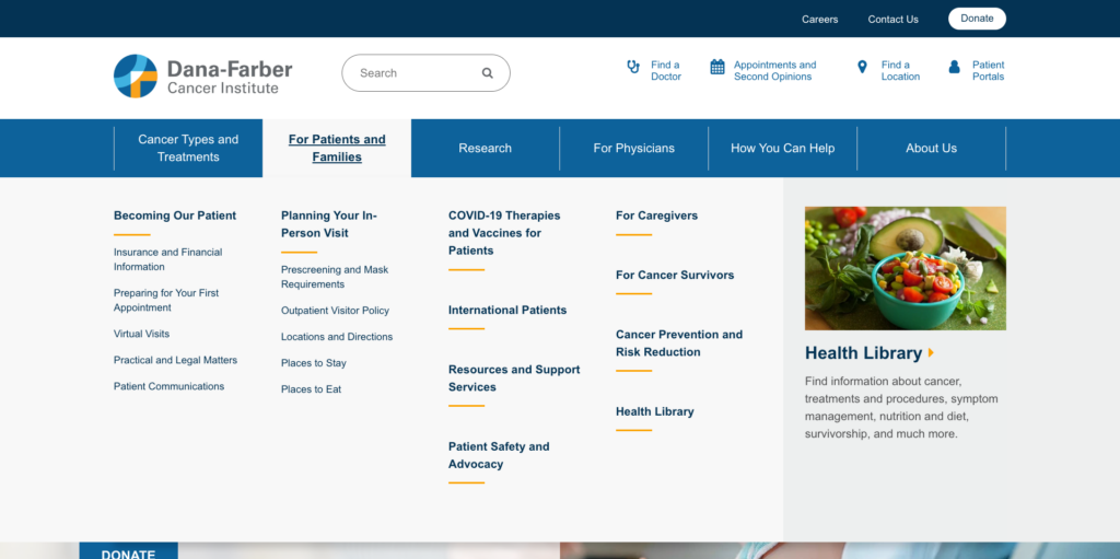
In the examples above, hovering over “For Patients & Families” opens up a large dropdown area with subpages for further exploration.
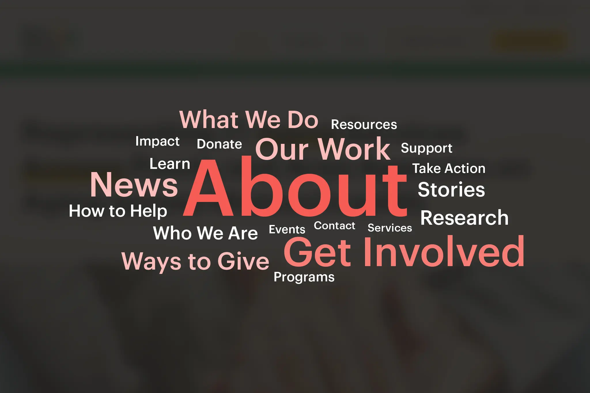
The most frequently used labels
Unsurprisingly, “About” was the most common label used across all 100 websites, appearing in 68 of the 100 website navigations.
The second most commonly used label was “Get Involved,” which appeared in 35 out of 100 website navigations.
Here’s a full breakdown of the top 20 most frequently used labels:
| Label | Frequency |
| About | 68 |
| Get Involved | 35 |
| News | 21 |
| Our Work | 18 |
| What We Do | 15 |
| Ways to Give | 15 |
| Research | 13 |
| Stories | 13 |
| Who We Are | 12 |
| How to Help | 11 |
| Learn | 10 |
| Programs | 9 |
| Impact | 9 |
| Donate | 9 |
| Resources | 9 |
| Take Action | 9 |
| Support | 9 |
| Events | 8 |
| Services | 7 |
| Contact | 7 |
Here are the key takeaways
- “About” is a must-have in any navigation. Users need to understand your organization’s purpose and credibility.
- Labels like “Get Involved” and “How to Help” show nonprofits prioritize action-driven engagement.
- The rise of labels like “Stories” and “Impact” reflects the growing importance of storytelling in building connections with supporters.
Information, action, and mission-oriented labels
The chart below breaks down the top 20 most frequently used labels into three categories: Informational, Action-Oriented, and Mission-Focused. These categories provide insight into how the most popular navigation labels align with user needs.
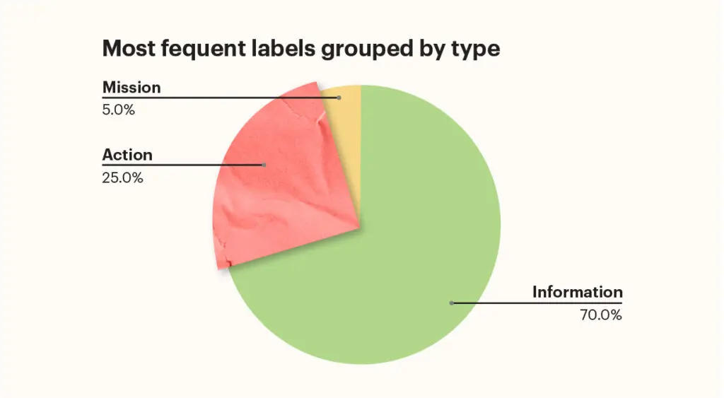
It’s clear from the chart that the majority of the most commonly used labels are still informational. These are labels such as “About,” “Our Work,” What We Do,” etc…
Mission-focused labels appear less frequently because many nonprofits communicate their mission within informational pages rather than as navigation labels.
While less common than informational labels, action-oriented labels are critical in driving user engagement. Labels like “Get Involved” and “Donate” are essential for encouraging tangible support.
Key Takeaways
Less is more
When it comes to designing your main navigation, less is more. The goal should be to keep it down to 6 items or fewer and to leverage mega-menus should they be necessary.
Don’t get fancy
Another key takeaway is to keep your choice of words simple for the menu. Stick to the labels that people have become familiar with, like “About” and “Get Involved.” Your main menu is not the place to experiment with novel techniques.
Just like with road signs, it helps that all stop signs are red hexagons.
Focus on information & action
Avoid using mission-oriented jargon in your main menu. While a label like “Advocacy” might make perfect sense to you, it provides very little wayfinding guidance for visitors. What will they find there? Is that a program area? Is this a way for visitors to get involved?